Legal aid on paper, not in practice
The Legal Aid Council of Nigeria (LACON) is the federal body mandated to provide free legal representation to Nigerians who can't afford it, covering criminal defence, civil matters, and human rights cases. Despite this mandate, access was severely limited by geography, bureaucracy, and awareness. Most people who qualified for legal aid never received it.
LACON needed a digital platform to transform how citizens applied for legal aid, how lawyers managed cases, and how the Council oversaw operations across all 36 states. My brief was to design a system that worked for three radically different users simultaneously.
Three users in a broken system
The applicant
A Nigerian citizen in crisis, often poorly educated, stressed, potentially in custody or supporting a detained family member. Has never interacted with formal legal systems before. Needs radical simplicity.
The legal aid lawyer
A LACON-assigned lawyer managing multiple cases across courts and states. Needs case tracking, document management, and communication tools, without having to use three separate systems.
The LACON administrator
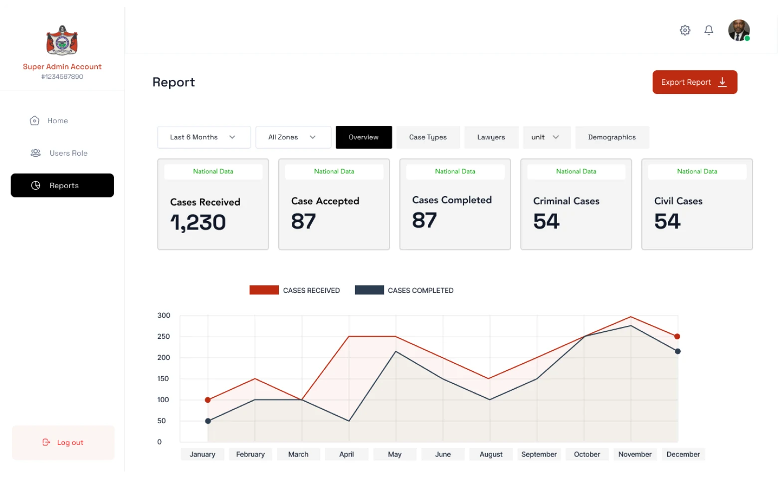
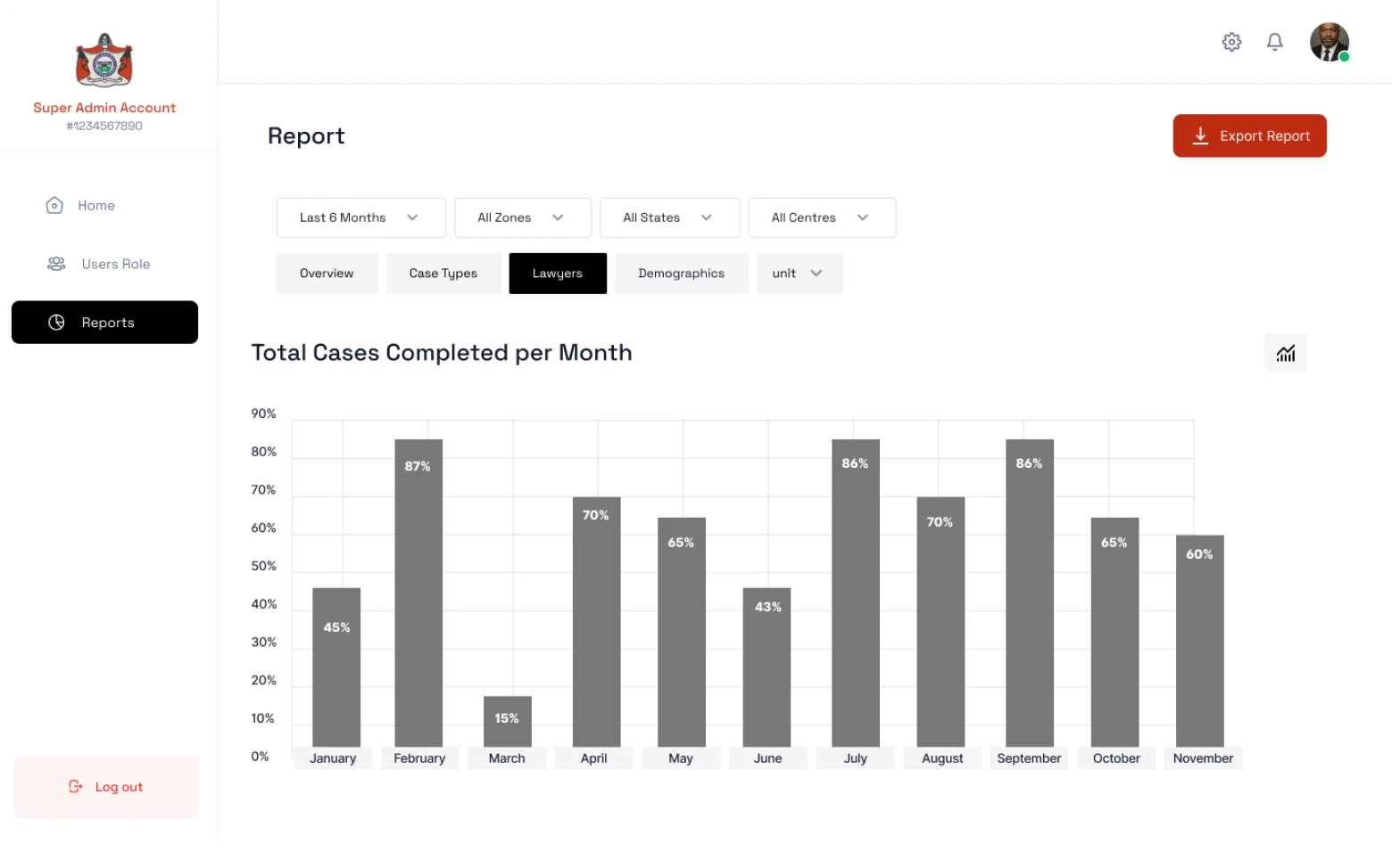
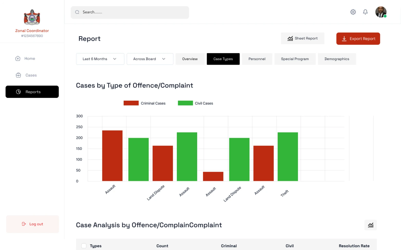
A council officer managing intake, assignment, and oversight. Needs visibility into caseload, geographic distribution, and resolution rates. Currently doing this in spreadsheets and folders.
Geographic access gap
LACON offices exist in every state but are clustered in cities. Rural applicants had no practical way to reach them. The digital platform had to solve access for people who couldn't walk in.
Designing access as the entry point
Eligibility as the first UX problem
Before a citizen applies, they need to know if they qualify. I designed an eligibility checker as the entry point: a short, plain-language screening flow that told people immediately whether they qualified, and if not, why and what alternatives existed. This prevented wasted applications and set expectations from the start.
Designing for low literacy and high stress
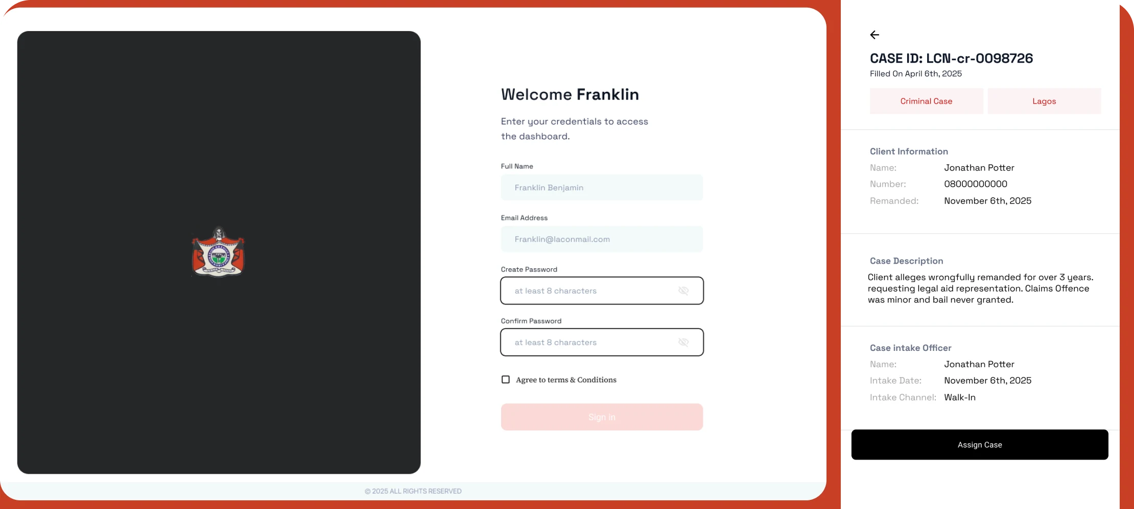
Applicants in crisis don't read carefully. I designed the application flow with short, single-question screens, plain language (no legal terminology), and clear progress indicators. Every question had a plain-English explanation of why LACON needed it. The form could be saved and completed in multiple sessions.
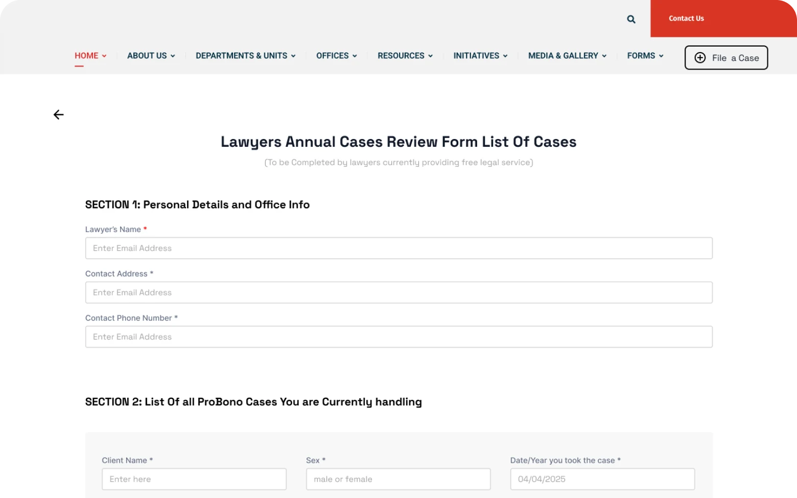
Case management for lawyers
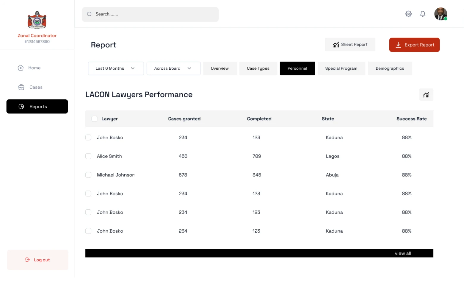
I designed a structured case management workspace for LACON lawyers: a clear case timeline, document upload and organisation, court date tracking, and a communication log with clients and administrators. This replaced an informal, paper-and-phone system that had no auditability.
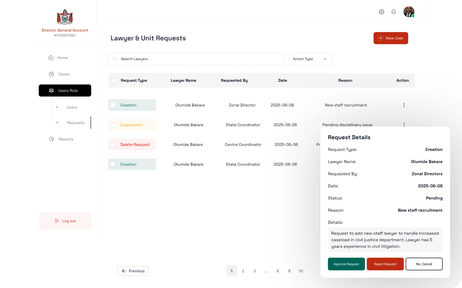
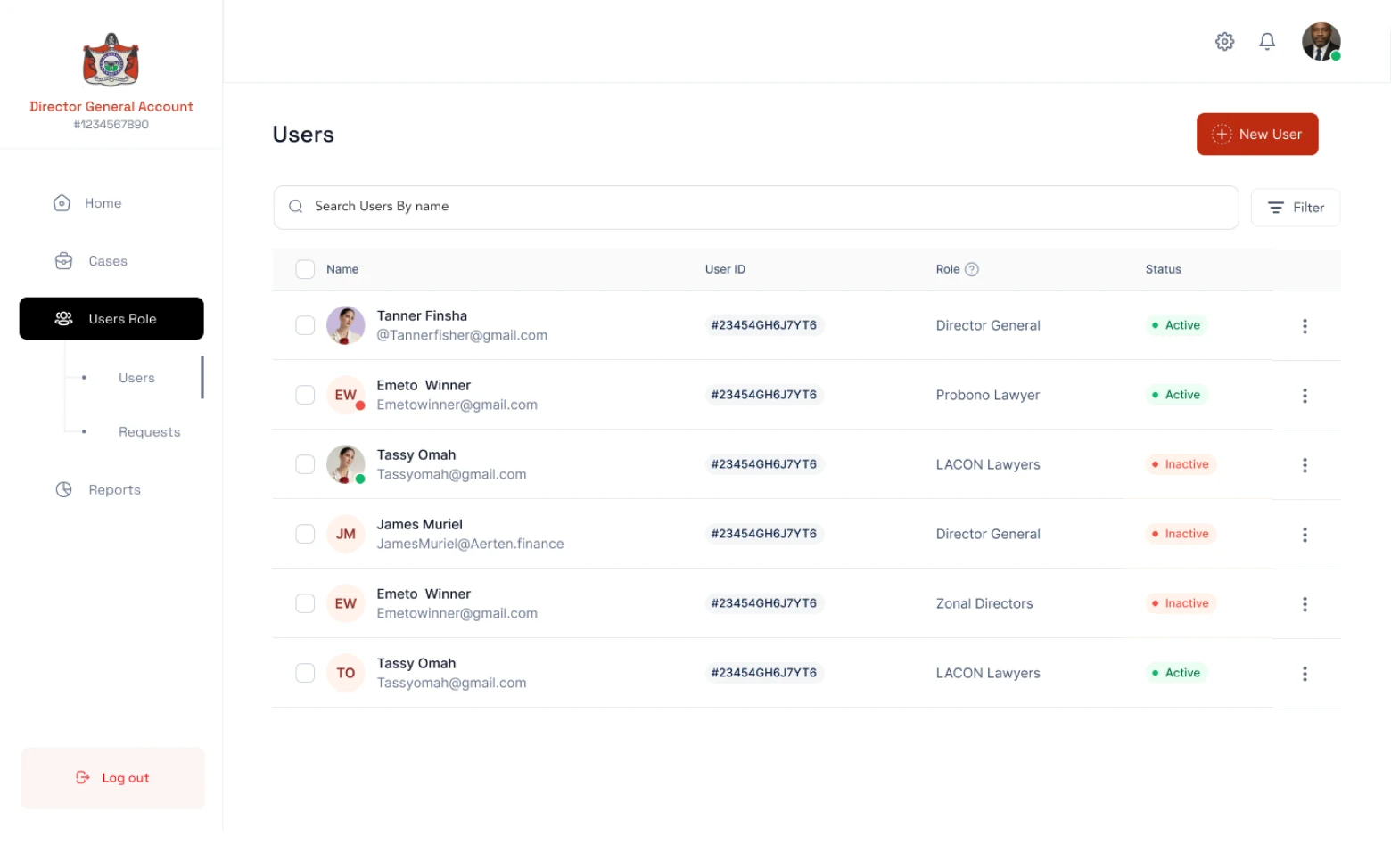
Assignment logic visible to admins
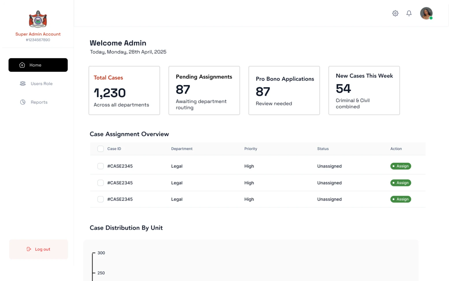
When a new application came in, an admin had to assess it and assign it to an appropriate lawyer based on case type, lawyer capacity, and geographic location. I designed a structured intake dashboard with filtering, priority flags, and one-click assignment, replacing a verbal/email process with a traceable system.
Status visibility for applicants
Once submitted, applicants had no way to know what was happening with their case. I designed a simple, phone-accessible status tracker, no login required, just a case reference number, showing where they were in the process and what to expect next.
The application intake flow
The citizen application flow was the hardest design problem. It needed to collect complex legal and personal information from people who were often frightened, in a hurry, and unfamiliar with formal processes.
One of the most impactful decisions was the reference number system. After submitting, applicants received a simple alphanumeric reference they could note down or screenshot. No account, no password, no login. They could check case status from any device, any browser, by entering just that reference, reducing the technical barrier to staying informed about their own case to near zero.
For the admin portal, the critical insight was that case assignment was a relationship problem, not a routing problem. I designed a lawyer profile view within the assignment workflow so admins could see not just capacity but case type expertise and current caseload composition, making better matches between cases and lawyers.
Designing for low digital literacy and high distress
LACON users are not a typical product audience. Many are poorly educated, in emotional distress, or accessing legal services for the first time. Accessibility here was not a compliance checkbox. It was the central design constraint.
WCAG AA colour contrast
All text and interactive elements were tested against WCAG 2.1 AA contrast ratios (4.5:1 minimum). The primary blue (#1e3a5f) on white meets AA at all text sizes. Status states used pattern and icon in addition to colour, never colour alone.
Touch target sizing
All interactive elements meet the WCAG 2.5.5 target size of 44×44px minimum. Forms were designed for one-handed mobile use, the primary access mode for rural applicants.
Plain language standard
All copy was reviewed to ensure a reading age of approximately 12 years, consistent with plain language standards used by the UK Government Digital Service and US Plain Writing Act guidelines.
Keyboard and screen reader
The application flow was tested with keyboard-only navigation and VoiceOver (iOS). All form fields carry descriptive labels, error messages are associated with their inputs via aria-describedby, and focus order follows reading order throughout.
Impact
The LACON platform moved Nigeria's legal aid access from a walk-in, paper-based system to a digital platform reachable from any state. Citizens could apply, track status, and receive updates without geographic barriers. The first time remote Nigerians had meaningful access to the legal aid system.
The case management system gave LACON lawyers a structured, auditable record of their work, replacing a fragmented paper-and-phone system. Administrators gained real-time visibility into caseloads, assignment status, and geographic coverage for the first time.
What this project reinforced
Designing for justice requires balancing empathy with operational efficiency. The citizen applying for legal aid and the administrator processing hundreds of cases a week have fundamentally different needs, and both are equally important to get right.
Prioritising the citizen's experience meant accepting more complexity on the admin side. Streamlining the admin workflows meant carefully designing citizen-facing flows that still collected everything needed without overwhelming people already under stress.
The work strengthened my ability to hold those two design imperatives simultaneously, and to treat service delivery infrastructure not as a back-office problem, but as a direct extension of access to justice.