Simplifying education at scale
Slate is a multi-platform education ecosystem designed to simplify and unify school operations across Abuja. Rather than introducing another isolated tool, Slate aimed to become the operational backbone for schools, bringing learning, administration, financial operations, reporting, and stakeholder engagement into a single connected experience.
Over an eight-month engagement, I contributed to the Learning Management System as part of the design team and served as the sole designer across several other areas of the ecosystem.
Four stakeholders, one ecosystem
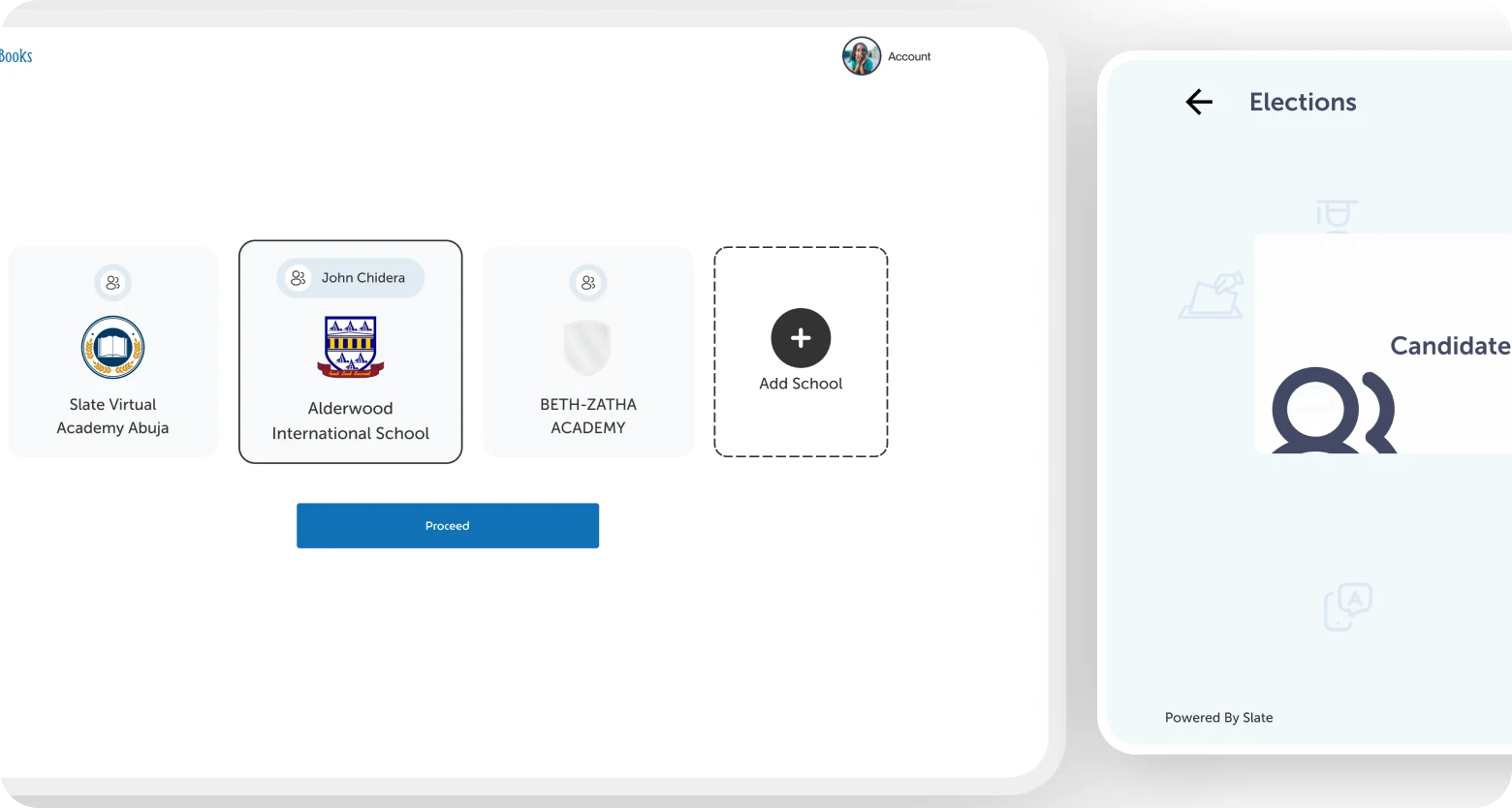
Designing Slate required balancing the needs of multiple stakeholder groups, each with different goals, responsibilities, and levels of technical proficiency. We collaborated directly with schools and gathered feedback from teachers, parents, and students throughout the process, informing decisions around terminology, navigation, and feature prioritisation.
School administrators
Needed oversight across all classes, finances, and staff. Cared about reporting, bulk operations, and operational visibility across the institution.
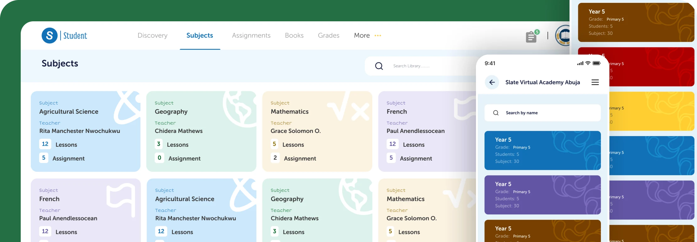
Teachers
Needed fast access to learning tools and class management features. Speed and clarity were essential. Complex workflows weren't an option in a classroom setting.
Parents
Needed visibility into their child's progress, upcoming fees, and school communications, without needing to learn complex software to get there.
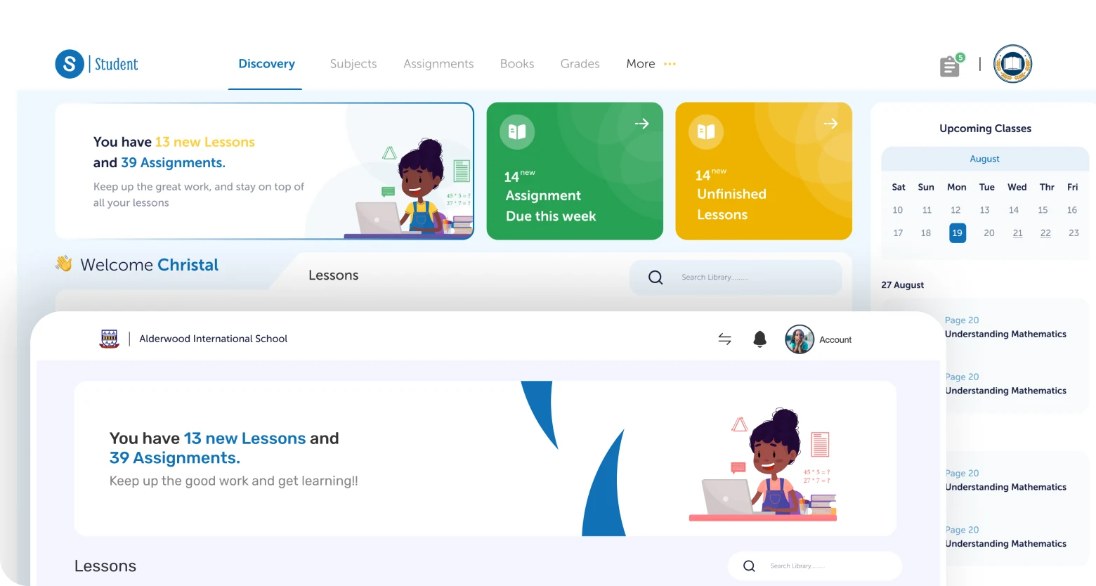
Students
Needed structured access to learning materials, assignments, and results. Experiences had to feel approachable and focused across varying levels of digital literacy.
A unified ecosystem, not a collection of tools
Slate extended beyond traditional learning management. The ecosystem included several interconnected areas, each designed to reduce fragmentation across educational processes.
Teaching & learning
Supporting teaching and learning activities through structured digital experiences. I contributed to this area as part of the wider design team, working on core LMS flows and interface patterns.
Operational management
Helping institutions manage operational processes more efficiently: from student records and staff management to scheduling and communication across the school hierarchy.
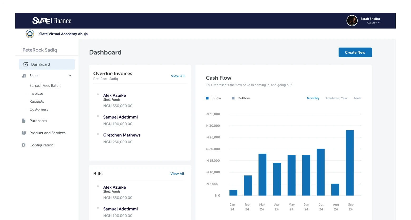
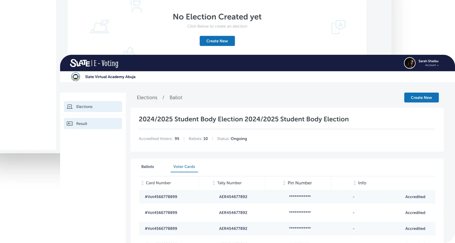
Financial interactions
Providing a clearer and more organised approach to handling financial interactions within schools, covering fee collection, payment tracking, and financial visibility for administrators and parents.
Insights & decision-making
Enabling stakeholders to access insights and monitor educational activities through reporting tools designed for decision-making at the school and administrator level.
How I approached the work
Information architecture
With multiple user groups and interconnected modules, I started by mapping the structure of the ecosystem, defining how content, data, and tasks related across roles before any interface design began.
User flow design
Each user group required distinct flows for their core tasks. I mapped these end-to-end, identifying where flows intersected across roles and where they needed to diverge, ensuring the system worked for all users without burdening any single one.
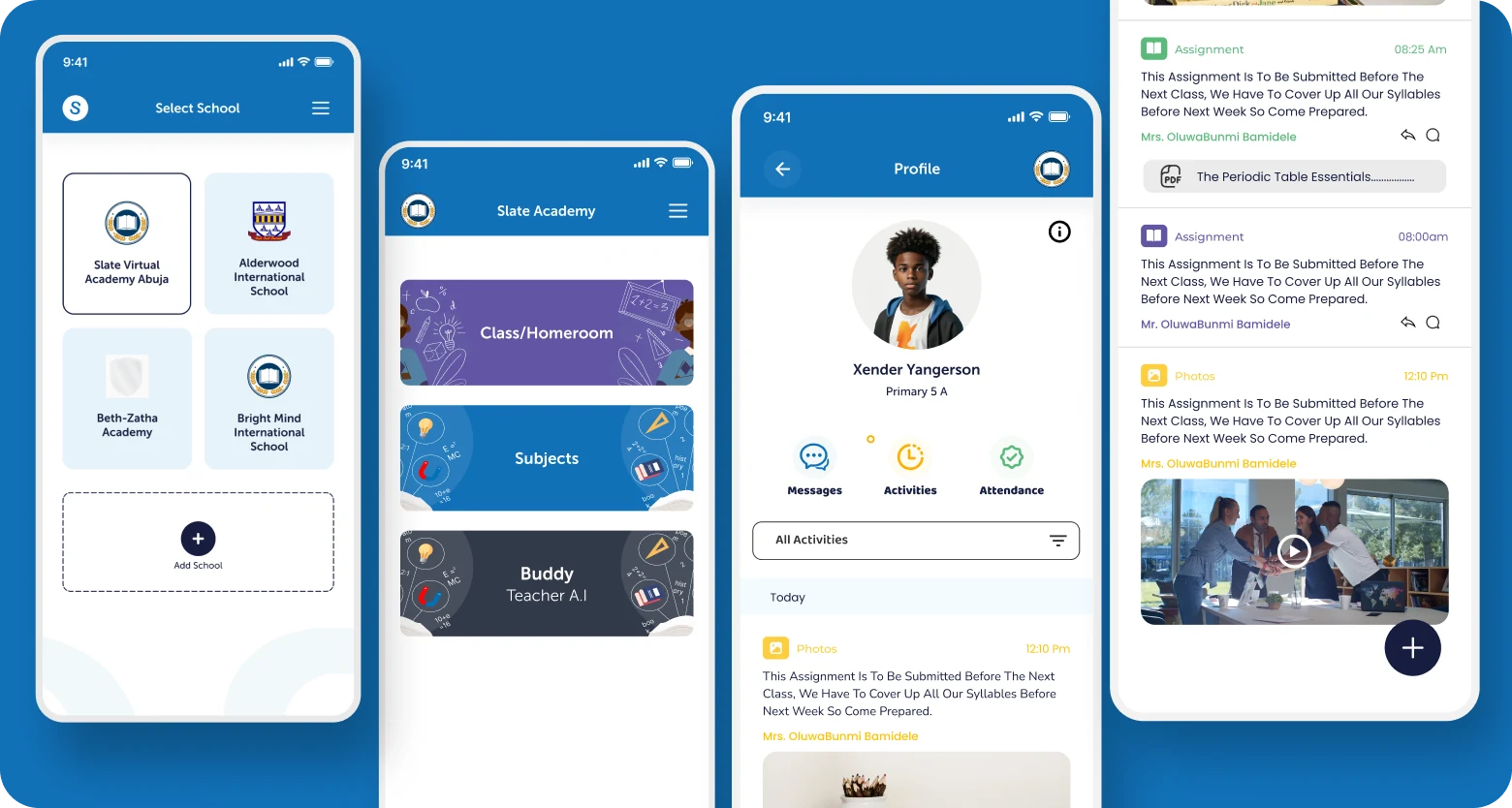
Interface design
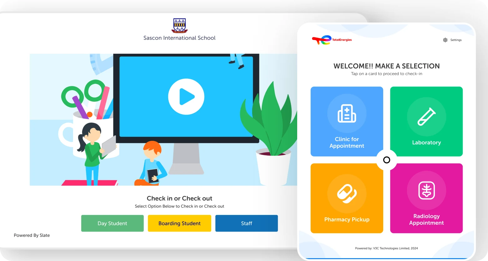
Translating flows into interfaces designed for each platform's context: desktop for administration, mobile for parents and students, tablet for classroom use, and kiosk for high-frequency, simplified interactions.
Cross-platform experience design
The objective wasn't to replicate screens across devices but to optimise experiences for how people actually worked. Each platform adapted the same underlying system, not duplicating it, to match the interaction model and usage context of its users.
Stakeholder collaboration & iteration
Regular design reviews with stakeholders across the school network ensured decisions stayed grounded in real operational needs. Feedback from teachers, parents, and administrators shaped each iteration throughout the engagement.
What shaped the work
Two major challenges defined the engagement and influenced how design decisions were made throughout the project.
Navigating technical constraints
Design decisions had to account for implementation realities. Working closely with engineering teams meant constantly balancing ideal user experiences with what was technically feasible within the project's scope and timeline. Constraints often became opportunities, surfacing moments to simplify flows and focus on what mattered most to users rather than what was possible in theory.
Aligning stakeholder expectations
Educational products serve multiple audiences, each with competing priorities. Teachers, administrators, parents, and business stakeholders all had different perspectives on what success looked like. A significant part of the work involved identifying common goals, surfacing conflicting requirements early, and designing solutions that balanced user needs with organisational objectives, without letting any single group's preferences override the system as a whole.
Impact
The redesign contributed to an 8% increase in user engagement following launch, alongside improved stakeholder satisfaction among participating schools and increased adoption of the platform's capabilities.
Reduced friction across educational workflows and more intuitive navigation meant users could complete tasks faster and with less confusion, whether they were administrators managing the institution, teachers running a class, or parents checking in on their child.
Across all four user groups, qualitative research conducted post-launch confirmed that the platform provided a cohesive, navigable experience, a measurable shift from the fragmented, multi-tool processes it replaced. The kiosk flow specifically was credited with reducing queue times for fee payment at front-desk staff.
What this project reinforced
Slate reinforced the importance of systems thinking in product design. Complex products are rarely difficult because of the number of screens they contain. They become challenging because of the relationships between users, processes, goals, and constraints.
Designing for education meant understanding those relationships and creating experiences that reduced complexity without reducing capability. The platform needed to feel simpler for every user group, not by removing functionality, but by surfacing the right things in the right context.
The project strengthened my ability to work across multiple platforms, navigate competing stakeholder priorities, and design products that support real operational needs at scale.