A payroll system bleeding billions
Nigeria's Integrated Personnel and Payroll Information System (IPPIS) manages federal government payroll across hundreds of Ministries, Departments, and Agencies. The system was plagued by ghost workers: fictitious employees collecting salaries, and data inconsistencies costing the Nigerian government billions of naira annually.
The EDVMS (Employee Data Validation and Management System) was commissioned to clean up this data: verify that every person on the federal payroll actually exists, is actively employed, and has correct biometric and employment records.
Understanding the problem space
Before designing anything, I spent time understanding the existing data collection and verification workflows, and why they failed.
The ghost worker problem
Employees on the payroll who didn't exist, had retired, or had died. No system existed to systematically catch and flag them.
Fragmented data sources
Records lived across physical files, multiple databases, and ministry-specific spreadsheets. No single source of truth existed.
Bulk actions at high stakes
Operators needed to process hundreds of records at once, but bulk actions in a payroll system carry real financial and legal consequences. Designing them safely was a critical challenge.
Multi-tier administration
Federal HQ, state offices, and ministry-level operators all needed different views of the same data, with strict access controls at each level.
Designing confidence, not just throughput
Mapping the validation workflow end-to-end
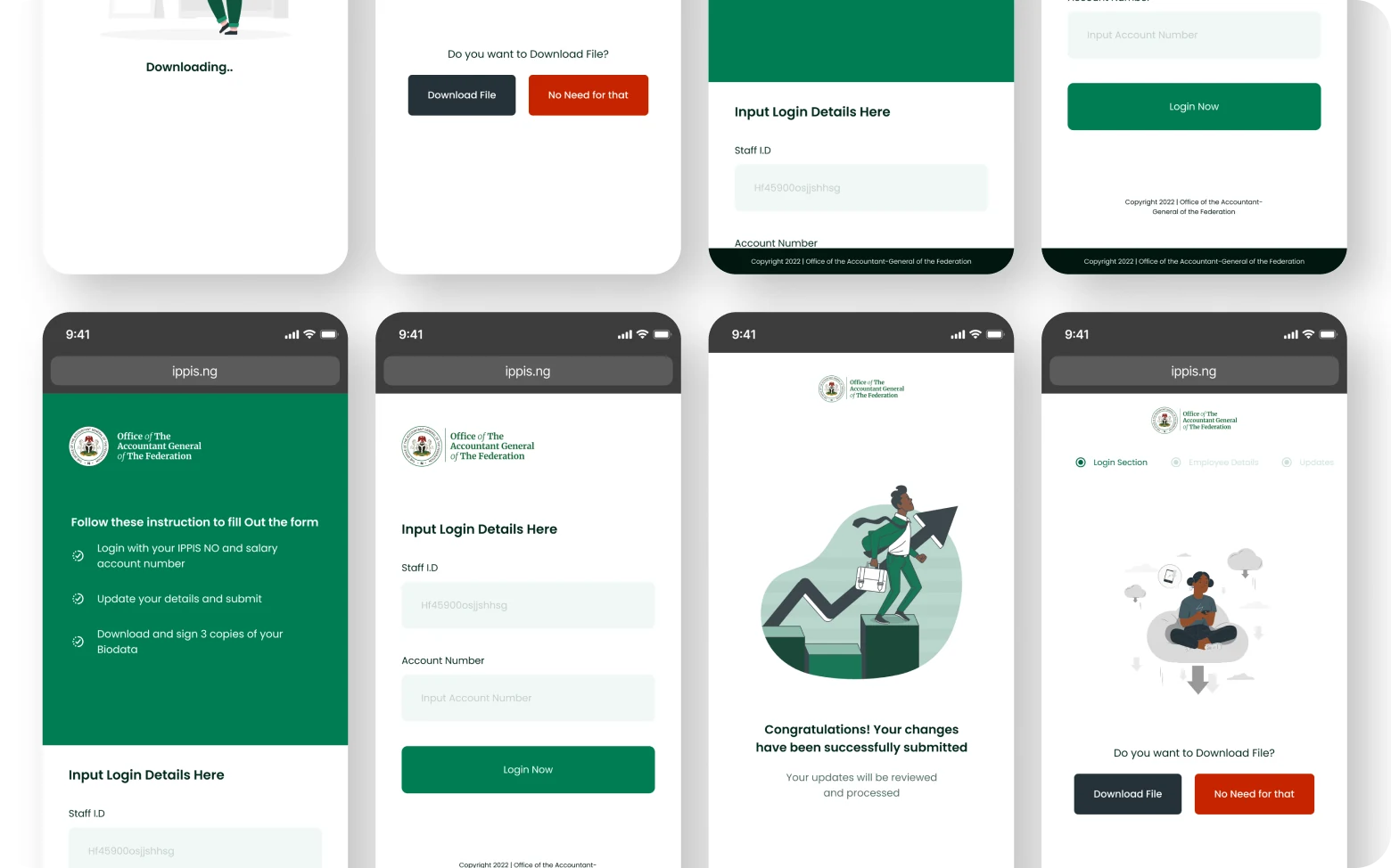
I mapped the complete journey from data submission → biometric capture → record matching → discrepancy flagging → resolution → sign-off. This gave me a clear view of where design could reduce friction and where human judgment was irreplaceable.
Designing for operator confidence, not speed
Early pressure pushed for a fast, high-throughput interface. I pushed back, in a system where errors have financial and legal consequences, confidence beats speed. The design prioritised clear status communication over cramming more records per screen.
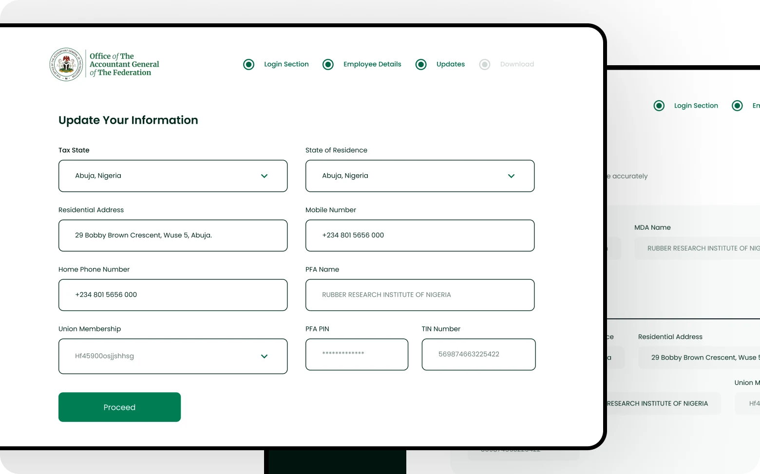
Progressive disclosure for complex records
Each employee record contained 30+ data fields. I designed a layered view: summary card → expanded profile → full audit trail. Operators saw what they needed for a decision without being overwhelmed by irrelevant data.
Status states as first-class UI
Every record had a lifecycle: Unverified → In progress → Verified / Flagged / Escalated. I designed a complete status system: colour, icon, label, and audit trail, so any operator could immediately understand where a record stood without reading through history.
Role-based access as a UX problem
Federal admins, state coordinators, and ministry operators each saw a different version of the dashboard. I designed three distinct "entry points" into the same underlying system, not separate products, but one system with role-aware surfaces.
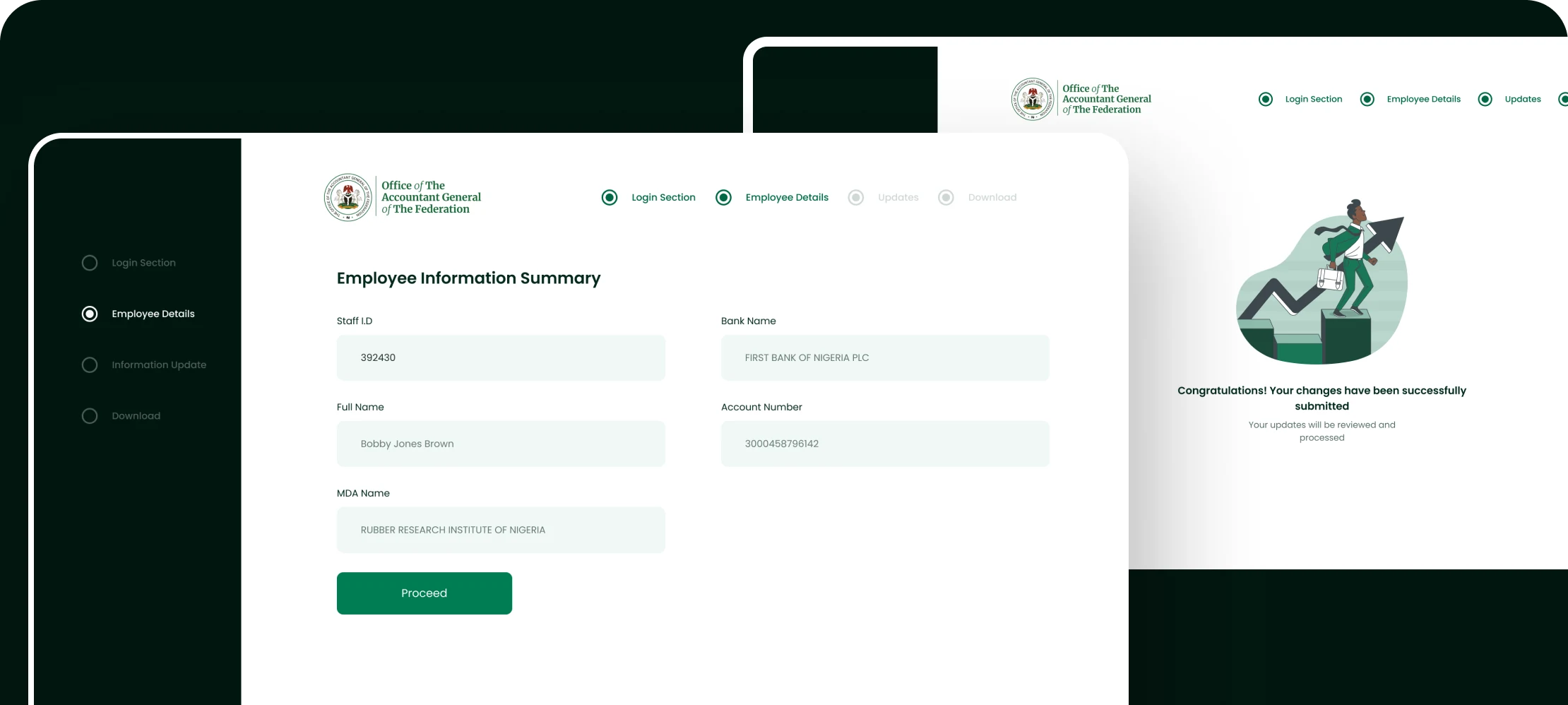
The validation dashboard
The core admin surface was a real-time validation dashboard, showing the live status of every employee record batch being processed across all ministries simultaneously.
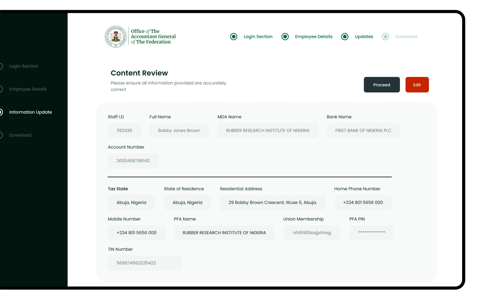
The most debated design decision was the discrepancy escalation flow. When an operator flagged a record (biometric mismatch, missing documentation, duplicate entry), the system needed to route it to the right person for resolution. I designed a structured escalation tree: local operator → state coordinator → federal admin, each with clear accountability and deadline timers.
This replaced an informal "send an email to HQ" process that had no audit trail, no accountability, and no resolution timeline.
Impact
The EDVMS delivered a 40% improvement in validation process efficiency compared to the previous manual approach. The structured discrepancy escalation system created accountability trails that didn't previously exist. Every flagged record now had a resolution history.
The platform was used across federal ministries, with state-level coordinators managing their own validation batches within the federal oversight framework. This was the first time the federal government had a real-time view of payroll data integrity across all MDAs simultaneously.
Working with the engineering team
The EDVMS was built by a backend-heavy engineering team with limited prior experience working from structured design specs. Early in the project I introduced a handoff protocol that reduced back-and-forth significantly.
Every screen was annotated with: interaction states (hover, focus, disabled, loading, error, empty), responsive breakpoint behaviour, WCAG contrast ratios for colour values, and edge case notes (e.g. what happens when a record batch contains 0 valid entries, or when a ministry has no assigned lawyer). Engineers reported that the annotation layer cut QA revision cycles by removing assumptions on both sides.
The bulk action confirmation flow went through three engineering reviews before sign-off, each one surfacing a constraint (transaction locks, rollback windows, audit log timing) that reshaped the UI. The final design was a direct product of that collaboration, not something handed over and implemented verbatim.
What this project reinforced
Enterprise experiences succeed when efficiency and safeguards coexist. The pressure on a validation platform is always to go faster: process more records, clear more batches, move through the queue. But in a payroll system at government scale, speed without safeguards creates exactly the errors it was built to eliminate.
The design work that had the most impact wasn't visual. It was structural. The escalation workflow, the bulk action confirmation states, the audit trail visibility: these were the decisions that determined whether the system would actually be trusted and used correctly over time.