01 One platform, many financial services
BM Pro Finance is a multi-currency financial platform designed to help users manage cross-border transactions through a seamless and transparent digital experience. The platform brings together international money transfers, currency exchange, virtual cards, payment processing, business banking capabilities, and investment-related experiences within a unified ecosystem.
Over 1 month and 3 weeks, I designed the platform from idea to launch as its Product Designer. The product did not exist before the engagement — the work ran from first concepts through to shipped surfaces across web, mobile and admin, with the founder as the main feedback loop throughout.
<strong>The objective:</strong> create an experience users could trust, particularly when moving money across borders, where every interaction carries real financial consequence and uncertainty is the enemy of adoption.
02 Simplifying financial complexity without losing confidence
Financial products often ask users to make high-stakes decisions in environments filled with unfamiliar terminology, fluctuating exchange rates, hidden fees, and complex workflows. For BM Pro Finance, the challenge extended beyond aesthetics.
Clarity and trustworthiness
Financial information needed to feel clear and approachable, not buried in jargon or presented in ways that created uncertainty before a user could act.
Designing from zero
There was no existing product to iterate on. Every flow, pattern and standard had to be established from scratch — and still ship within seven weeks.
Multi-product ecosystem
Supporting transfers, exchange, virtual cards, payments, and investments within one platform required coherence, so users never felt lost when moving between services.
Depth without overwhelm
Reducing friction couldn't come at the cost of sophistication. Users expected the depth of a financial platform. The design had to deliver both simplicity and substance.
03 Designed end to end
BM Pro Finance extended across multiple financial capabilities. Rather than isolated screens, the work covered the full user journey: from first impression to ongoing account management.
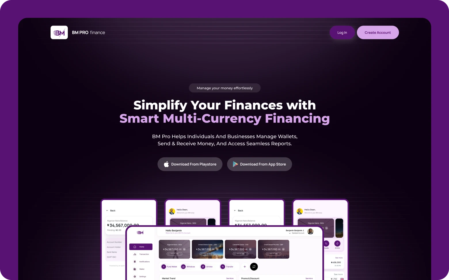
Marketing website
Communicating the platform's value proposition and helping users understand available services before signing up, building confidence at the point of first contact.
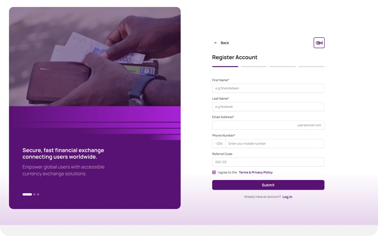
Onboarding & verification
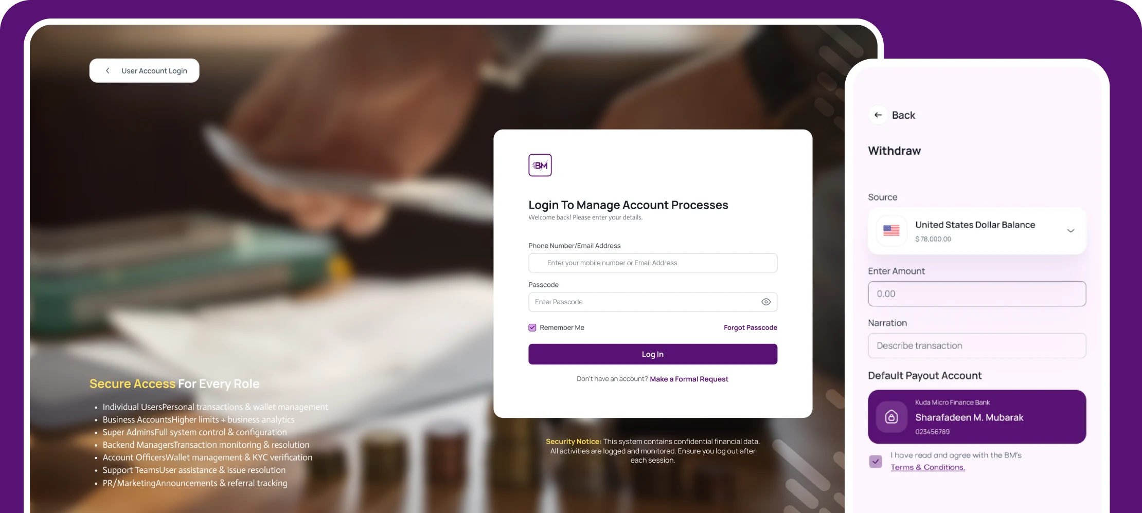
Guiding users through the steps required to begin using the platform, structuring compliance requirements in a way that felt clear and progressive rather than overwhelming.
Dashboard, transfers & currency conversion
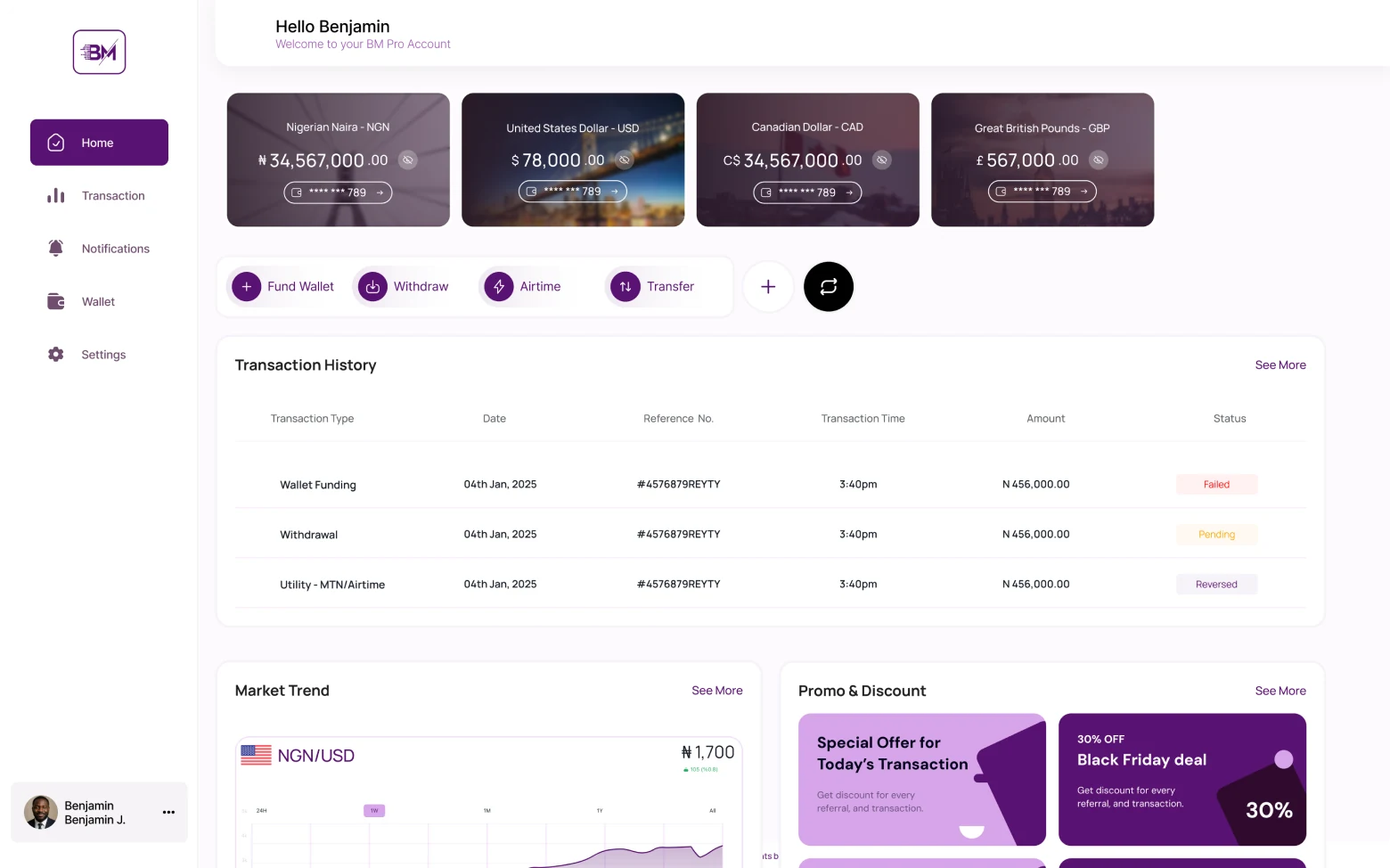
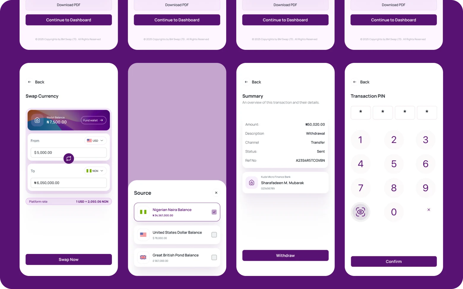
A clear overview of balances and activity, combined with flows for initiating cross-border transactions and exchange, where the most critical trust decisions happen and financial information had to be presented with full transparency.
Virtual cards, transaction history & notifications
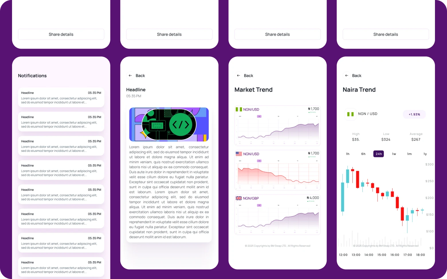
Supporting digital spending, providing visibility into previous activities, and keeping users informed about important updates and transaction states through a consistent notification system.
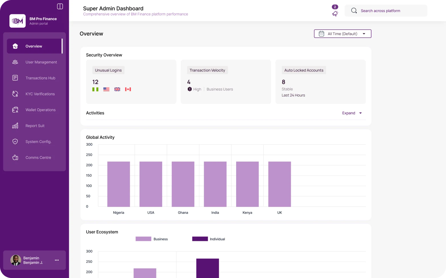
Settings, compliance & administrative experiences
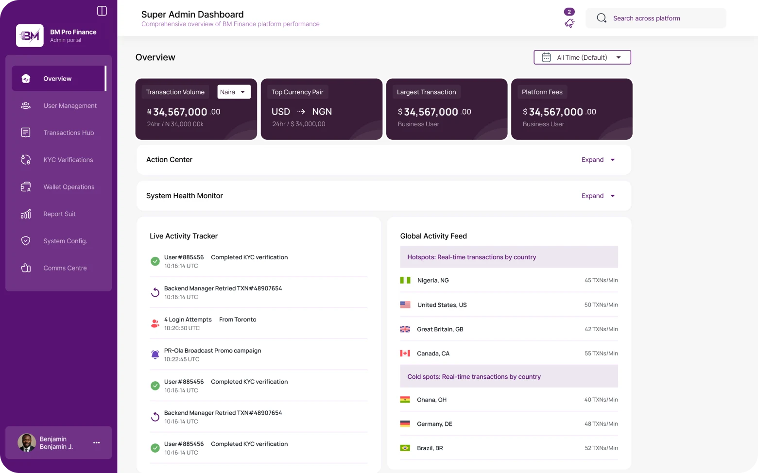
Enabling users to manage their accounts, accommodating regulatory requirements without friction, and supporting internal teams responsible for monitoring platform activity.
04 Clarity as a design principle
One of the most significant challenges involved simplifying financial concepts without reducing users' confidence in the platform. Financial products frequently rely on terminology and processes that are intimidating to everyday users.
The design approach focused on presenting financial information in digestible formats, reducing ambiguity in transaction flows, and ensuring users understood their options before committing to any action.
This meant surfacing exchange rates and fees early, before a user was deep into a flow, so that decisions felt informed rather than rushed. Progressive disclosure kept complexity available without making it unavoidable. Consistency across the ecosystem meant users who understood one flow could navigate any other with confidence.
05 Impact
Designed from zero and shipped across the full ecosystem — web portal, mobile app and admin system — in roughly seven weeks.
Honesty note. This engagement had no formal user research and no instrumented metrics. Direction came from the founder's brief, product judgment, and the founder's review of the design as it developed — so the claims here are limited to what shipped.
06 What this project reinforced
Designing for fintech reinforced the importance of clarity in moments of uncertainty. Users interacting with financial products are often making decisions that carry emotional weight and financial consequences.
Success, therefore, is not simply about creating attractive interfaces. It is about reducing anxiety, increasing confidence, and helping users feel informed enough to act. Every screen either contributes to that or works against it. There is no neutral position in a financial product.
BM Pro Finance strengthened my ability to simplify complex domains, collaborate with diverse stakeholders — founders, engineers, operations, and customer-facing teams — and design experiences where trust is essential to adoption.
The decisions that mattered most on BM Pro were about information: what to show, when to show it, and how plainly to explain it — surfacing rates and fees before commitment rather than after.
07 The work